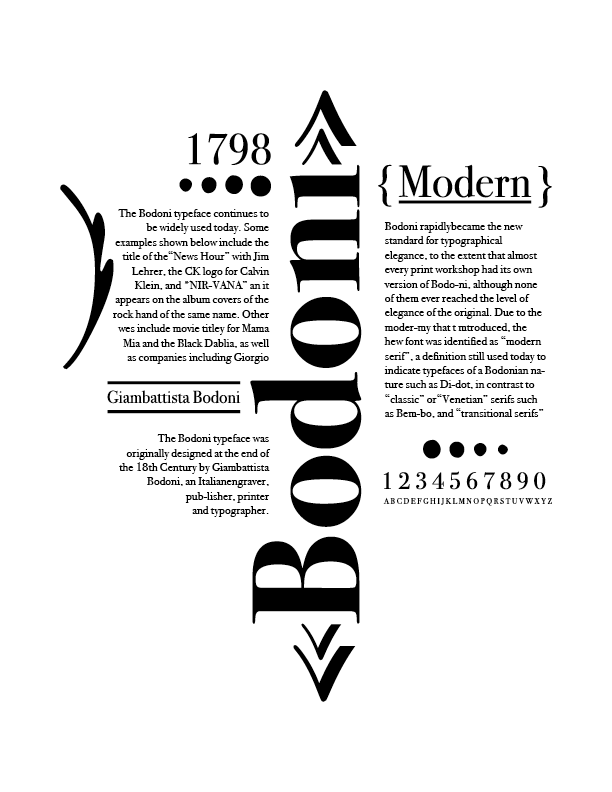


My client was a local type museum. They were looking for promotional posters for their new exhibit featuring classic typefaces and their history. I created a series of three typographic posters showcasing the distinct personalities and design potential of the typefaces Bodoni, Memphis, and Courier. Each poster highlights the unique characteristics of its respective font—Bodoni’s elegant contrast and modern sophistication, Memphis’s geometric structure and playful tone, and Courier’s utilitarian, monospaced aesthetic. The goal was to explore the expressive qualities of type through layout, scale, and composition, allowing each typeface to speak for itself while maintaining a cohesive visual language across the series. This project served as both a typographic study and a creative exercise in using type as the primary visual element.